CASE STUDY
Service center page template with SEO-first structure
A calmer, more scannable service page system that improves hierarchy and conversion without breaking CMS + SEO constraints.
01 — Problem
The page felt heavy, stitched together, and hard to scan.
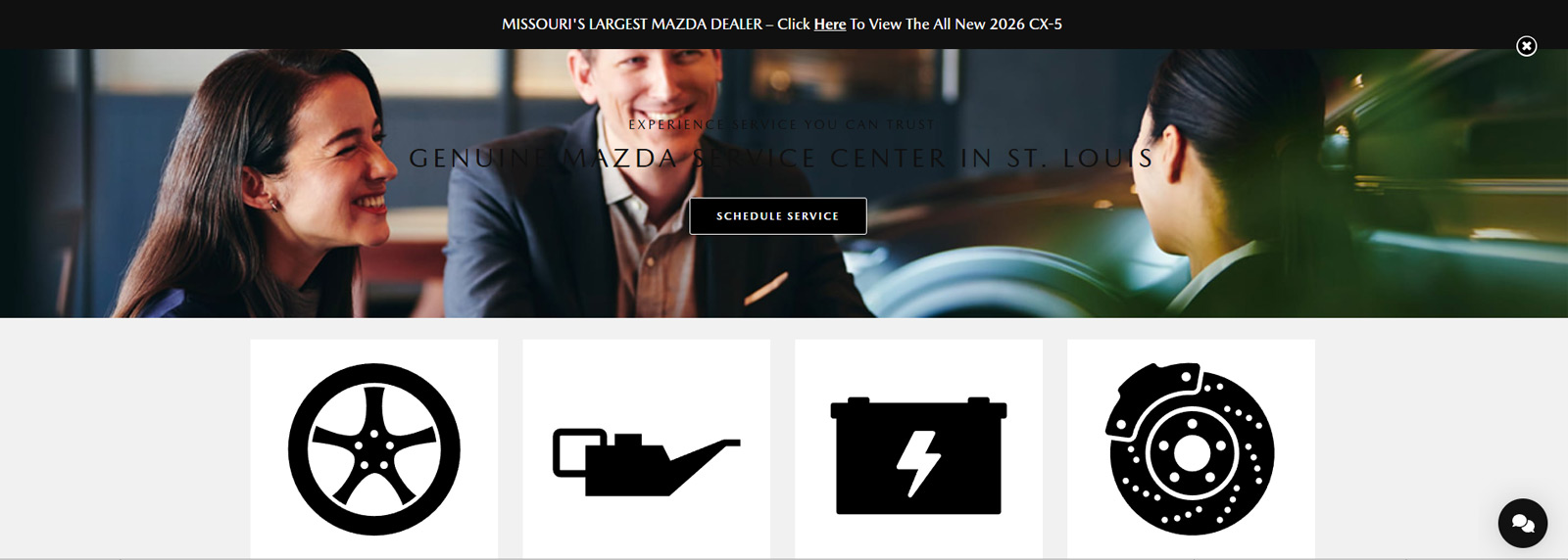
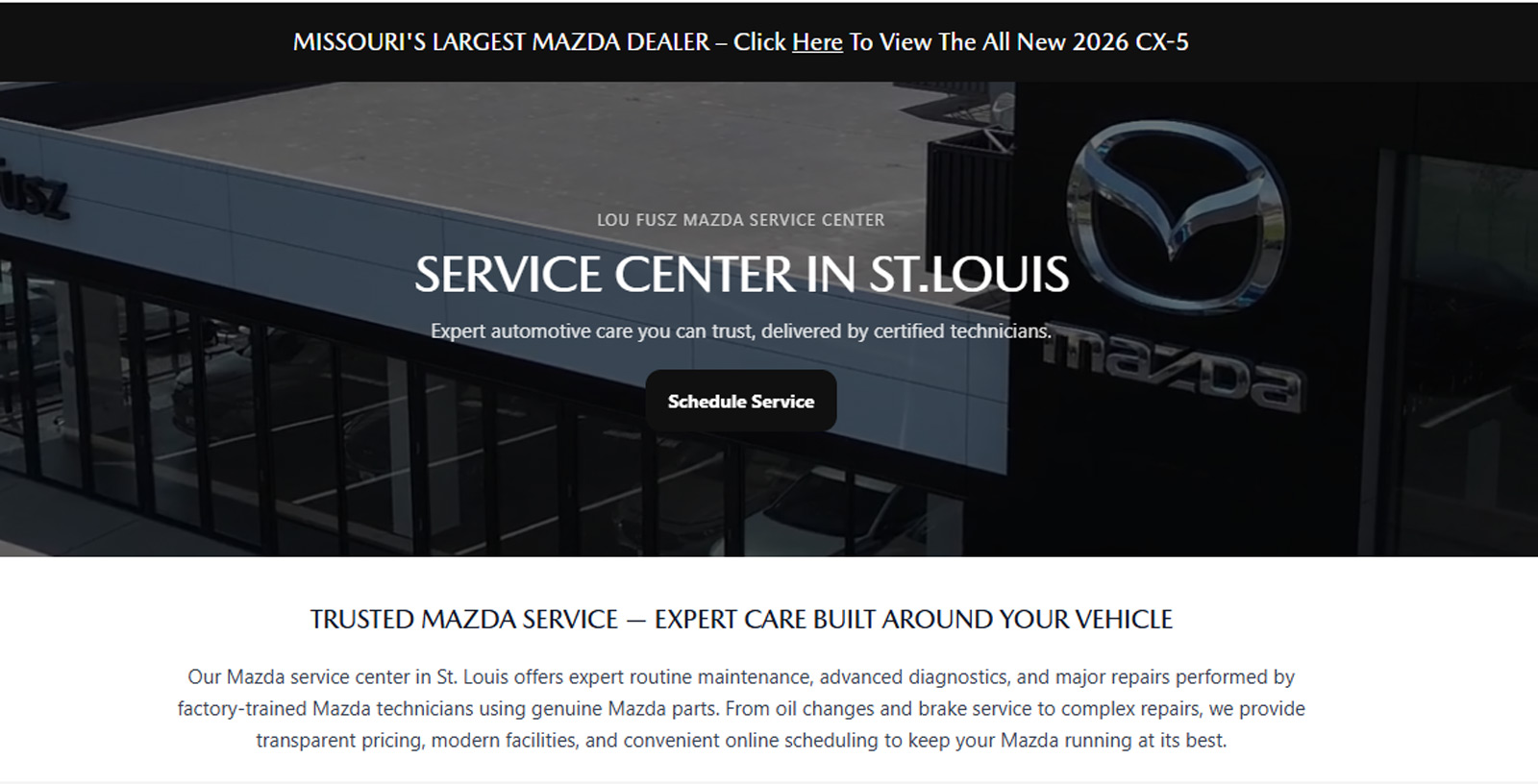
The Mazda Service Center page needed structural cleanup and visual modernization. The goal was to improve hierarchy, make the content easier to scan, and elevate the overall feel — without breaking CMS constraints or SEO structure.
- Visually heavy hero with weak hierarchy
- Inconsistent spacing and section rhythm
- Key info (hours, contact, value props) not clearly surfaced
- Content blocks felt stitched together instead of systemized
- Mobile experience lacked intention
02 — Constraints
Modernize without breaking the platform.
This wasn’t a greenfield redesign. The page had to remain compatible with the dealership CMS, preserve SEO structure, and keep production practical for future service pages.
- Keep single-page SEO structure intact
- Work within CMS components + layout constraints
- Support third-party overlays (chat, accessibility, etc.)
- Maintain quick update paths for service content
- Improve mobile rhythm without “custom app” complexity
03 — Approach
Restructure into a reusable, calmer system.
Instead of redesigning from scratch, I rebuilt the page into a cleaner structure that could be reused across service pages — improving hierarchy, scan flow, and CTA clarity.
Step 1
Hero simplification
Clear headline + supporting text + focused CTA, without visual noise.
Step 2
Trust block and scannability
Hours, phone, and “why service here” surfaced as a clean unit.
Step 3
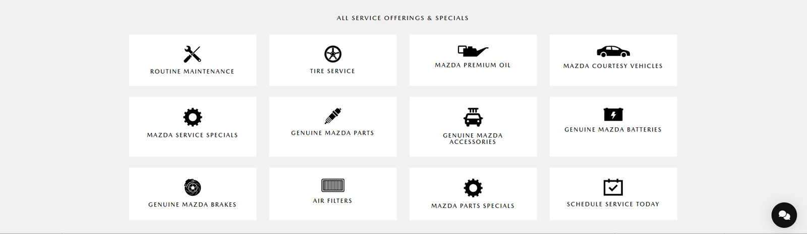
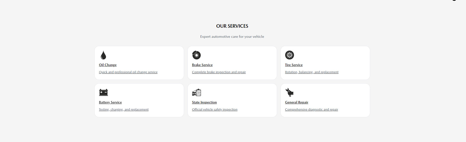
Reusable sections
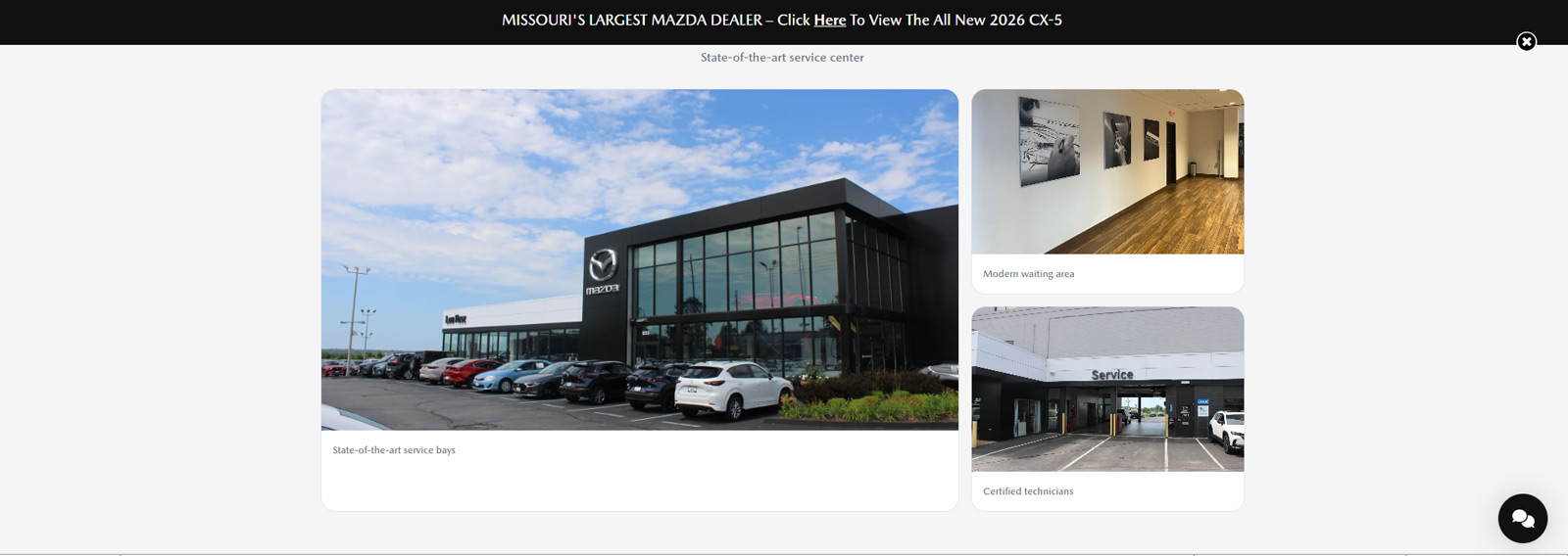
Service grid + amenities chips + facility imagery + strong closing CTA.
04 — System
Template sections designed to be reused across service pages.
The design principles were simple: hierarchy first, spacing as structure, and consistent CTA emphasis. The output is a page that feels calmer and more intentional while staying compatible with platform realities.
- Hero: headline → value → action (no extra noise)
- Trust block: hours + phone + “why service” surfaced early
- Service grid: card layout for scannable service categories
- Amenities: chip-style value props (fast read)
- Imagery: facility credibility without overwhelming the layout
- Closing CTA: “Schedule Service” emphasized top + bottom
05 — Outcome
Cleaner scan flow, stronger trust, clearer conversion.
01
Modernized structure
Cleaner hierarchy and spacing rhythm without disrupting SEO structure.
02
Improved scannability
Service info becomes easier to find: hours, contact, value props, services.
03
Reusable template
Section pattern can be reused across other dealership service pages.