
Stronger first impression
Large type and clean contrast make the brand feel intentional before the user even reads deeply.
SYSTEM STUDY
A minimal portfolio direction shaped by editorial scale, structured restraint, and a quieter sense of authorship.
Design principle
"Restraint is not a limitation — it is the system working."
Arrived at through this case study
Trend-heavy design ages in months. This study explores what stays standing — type, structure, and restraint over noise.
FOUNDATION
Large type and clean contrast make the brand feel intentional before the user even reads deeply.

The layout should show that the work is built on structure, not decoration or random visual moves.
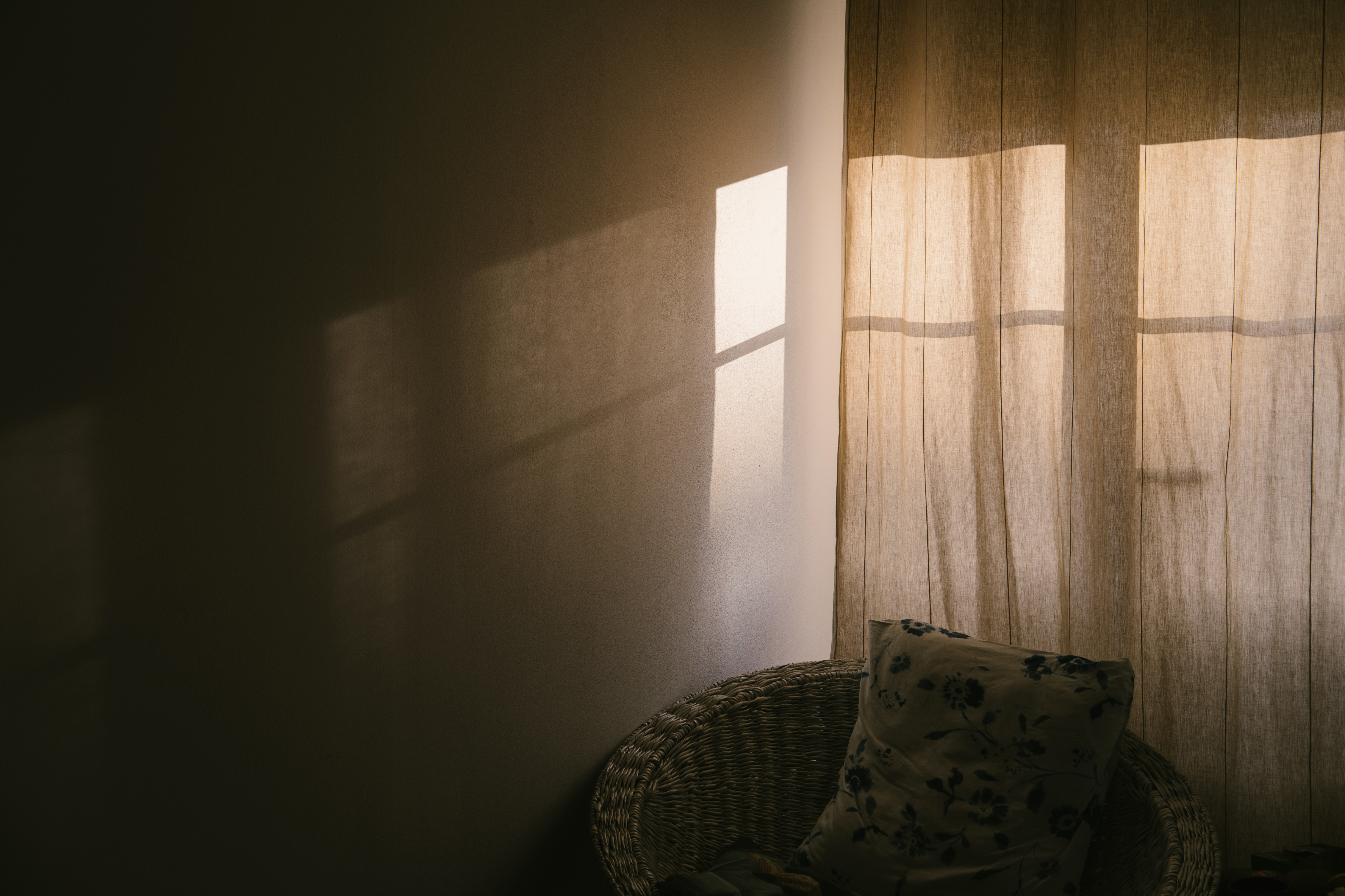
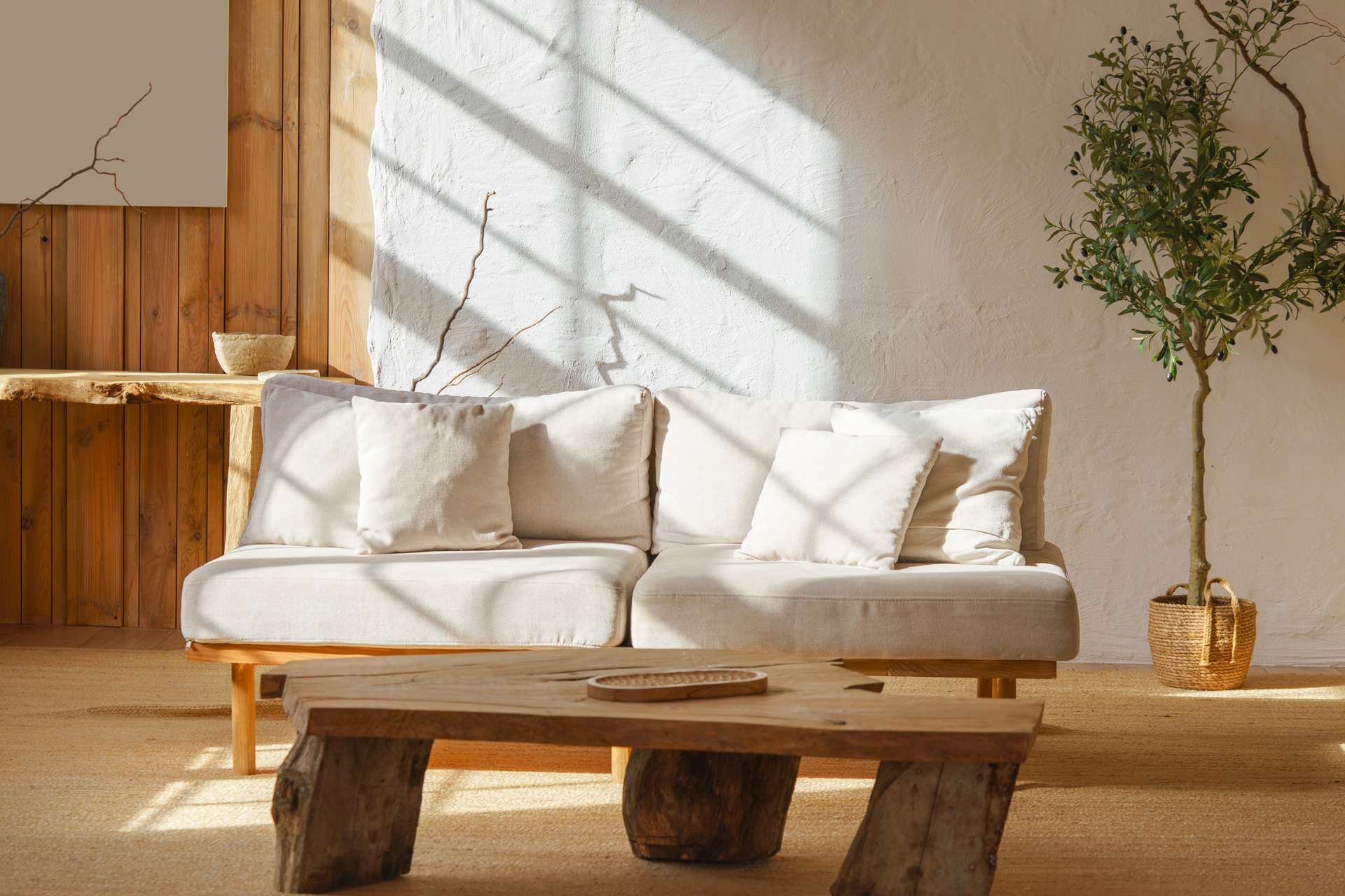
Neutral surfaces and restrained color create a quieter identity that fits your site better than mood-heavy backgrounds.
Images can support the narrative without turning the page into a collage of unrelated aesthetic gestures.
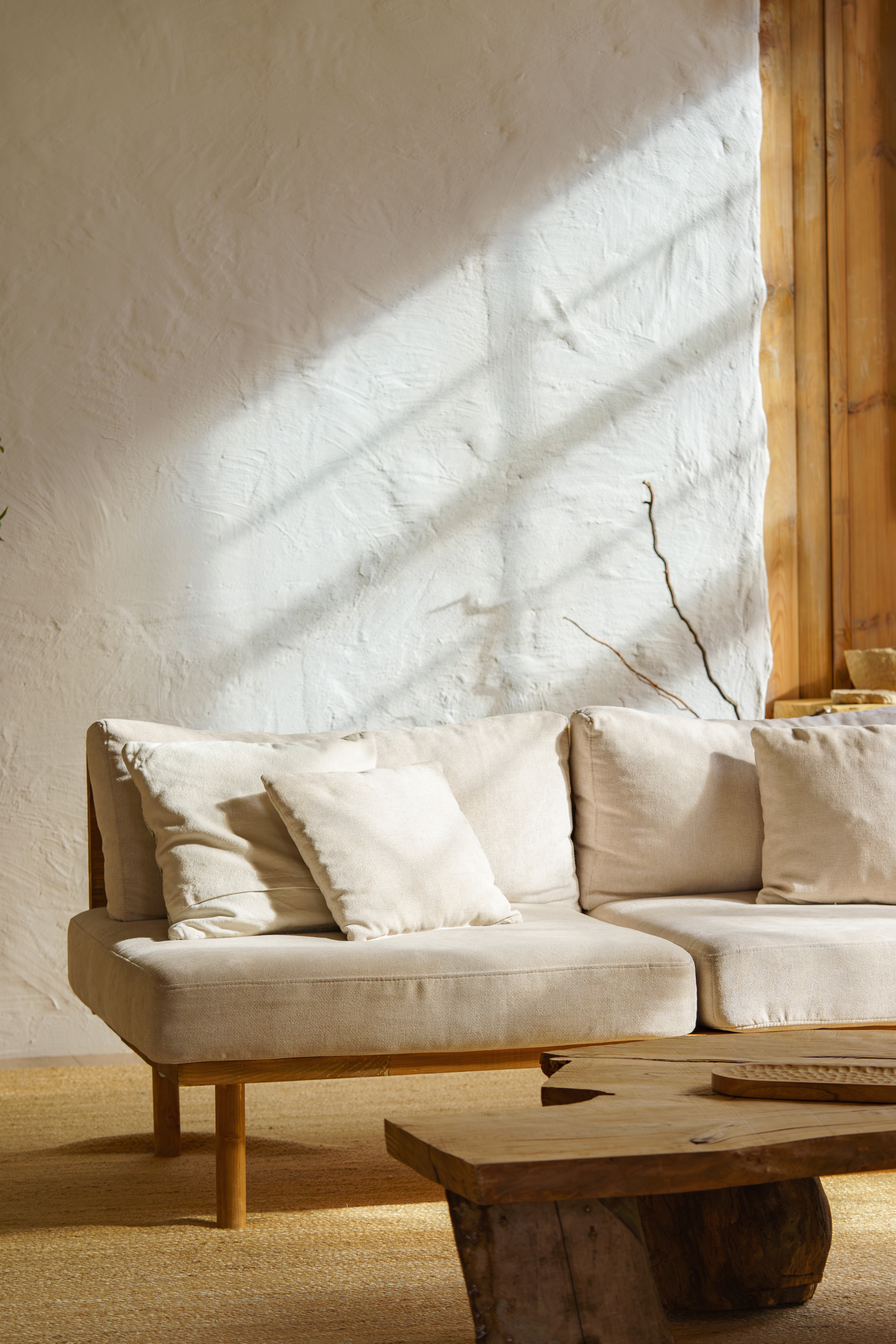
Warm neutral surfaces, soft grays, dark text, and only small moments of deep forest accent.

Real process, real tools, close crops, and quiet atmosphere — never generic stock mood for its own sake.
/* system tokens */
--bg: #F7F4EE;
--fg: #2A2A28;
--muted: #6B6A66;
--serif: "Libre Baskerville";
--sans: "Inter";
--mono: "JetBrains Mono";
--wrap: 1120px;
--pad: clamp(18px, 3vw, 46px);
Every decision lives in the token system — color, type, spacing, all in one place.
The page can feel expressive, but the underlying grid must stay rigid and repeatable.
Headlines
Inter for scale and control. Libre Baskerville used only when it adds editorial tension, not nostalgia.
Big hero, clean section blocks, and structured content rhythm underneath the emotional opening move.
NEXT MOVE
This direction works only if the homepage, project cards, and case pages continue the same logic: restraint, hierarchy, and proof over noise.
Back to Work